Visualization of Uncertain Time Series
for Manasa Shivakumar
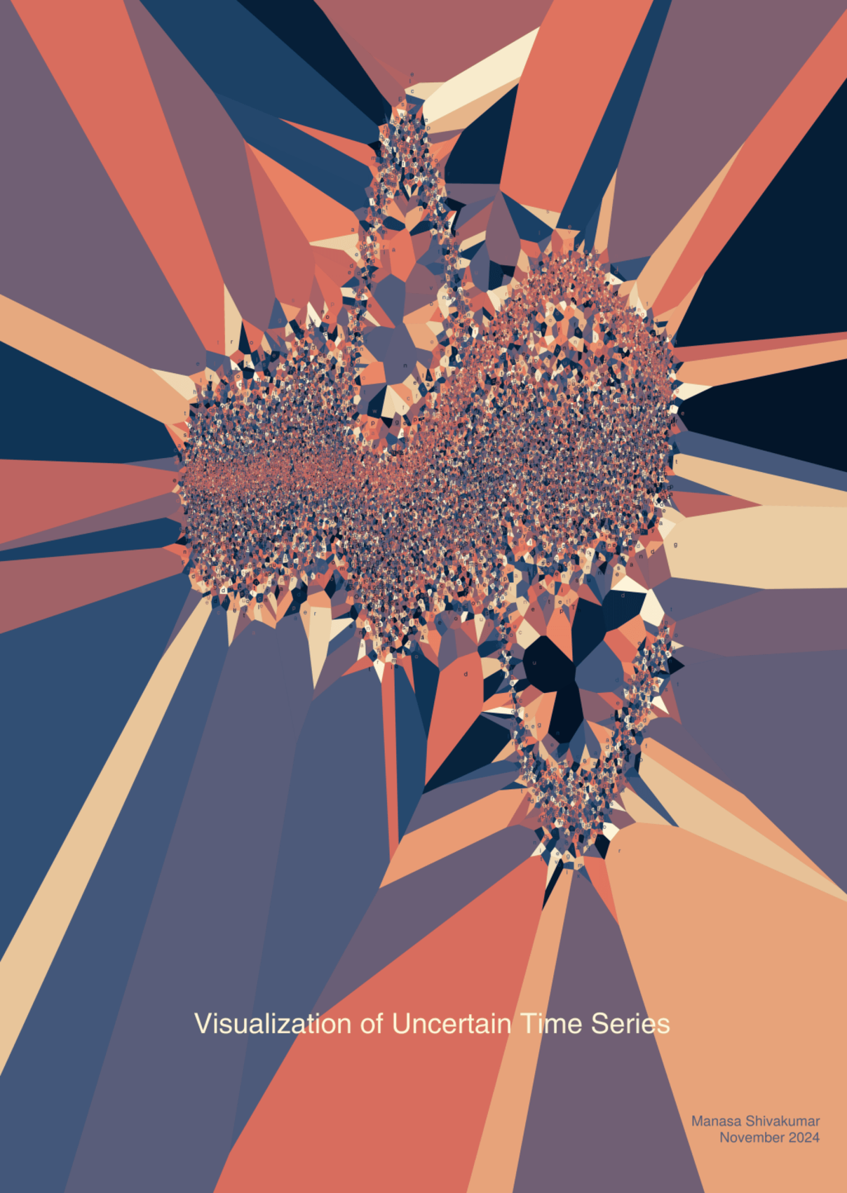
This thesis explores innovative ways to represent uncertainty in data visualization. Using a Voronoi-plot generated by the Makie.jl library, Benedikt Ehinger created a Thesis Art piece that illustrates how we perceive complexity in time-series data.
The Creation Process
The process began with the goal of visualizing uncertainty in overlapping time series using the stippling algorithm. The algorithm’s foundation, Voronoi diagrams, served as the backbone for generating scatter plots. However, the computational demands of handling numerous scatter points presented a significant challenge, leading to quite slow processing times. This limitation required extensive fine-tuning, and despite progress on employing GPUs, the technique remains a work in progress for real-world application.
Artistic Concept
Inspired by the thesis’s original plots, Benedikt adapted the visual concept by embedding time-series data into the art piece. The result emphasizes the chaotic interplay of overlapping uncertainties. The deliberate placement of text glyphs — aesthetic but unreadable — symbolizes the complexity and opacity of uncertainty itself. This artistic decision shifted the piece towards a more “cluttered” visual scale, prioritizing the abstract over the literal.
“Throughout, I was looking for a compromise between clutter and readability. In this piece, I finally decided to lean into the chaotic nature of uncertainty, creating an abstract interpretation that provokes thought rather than delivering clear readable text.”
Benedikt Ehinger
Personal Reflection
Despite its unconventional approach, the piece invites viewers to rethink how uncertainty can be communicated visually. This piece “pops” and it’s geometric forms and colors make it truely unique.
