A visual representation of intellectual pursuits

Author: Benedikt Ehinger

  • Shivakumar’2024

    Shivakumar’2024

    Visualization of Uncertain Time Series

    for Manasa Shivakumar

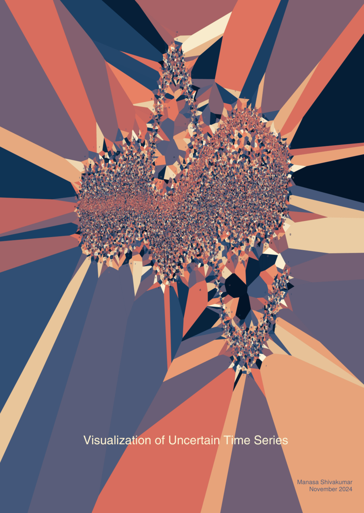
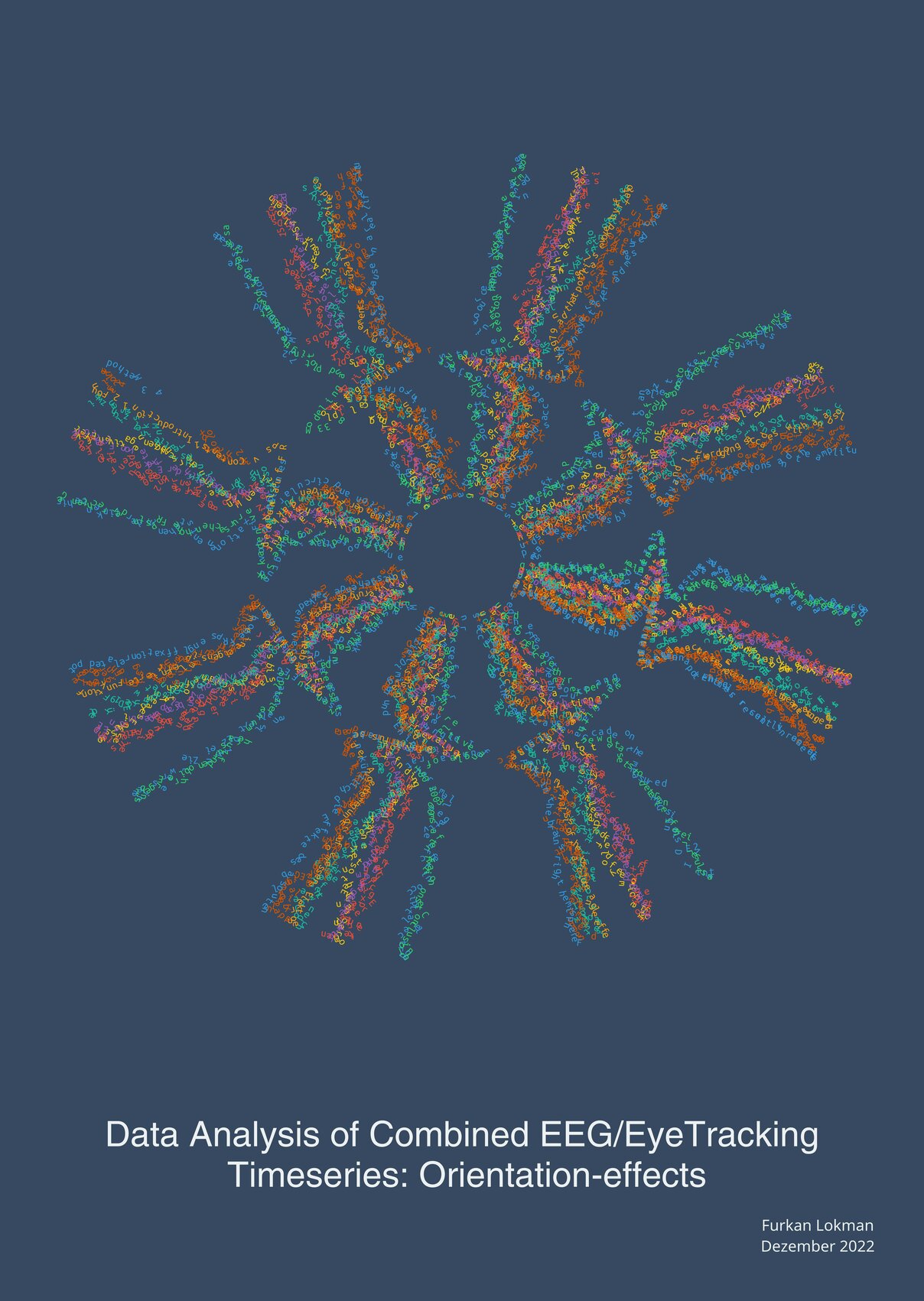
    This thesis explores innovative ways to represent uncertainty in data visualization. Using a Voronoi-plot generated by the Makie.jl library, Benedikt Ehinger created a Thesis Art piece that illustrates how we perceive complexity in time-series data.

    The Creation Process

    The process began with the goal of visualizing uncertainty in overlapping time series using the stippling algorithm. The algorithm’s foundation, Voronoi diagrams, served as the backbone for generating scatter plots. However, the computational demands of handling numerous scatter points presented a significant challenge, leading to quite slow processing times. This limitation required extensive fine-tuning, and despite progress on employing GPUs, the technique remains a work in progress for real-world application.

    Artistic Concept

    Inspired by the thesis’s original plots, Benedikt adapted the visual concept by embedding time-series data into the art piece. The result emphasizes the chaotic interplay of overlapping uncertainties. The deliberate placement of text glyphs — aesthetic but unreadable — symbolizes the complexity and opacity of uncertainty itself. This artistic decision shifted the piece towards a more “cluttered” visual scale, prioritizing the abstract over the literal.

    “Throughout, I was looking for a compromise between clutter and readability. In this piece, I finally decided to lean into the chaotic nature of uncertainty, creating an abstract interpretation that provokes thought rather than delivering clear readable text.”

    Benedikt Ehinger

    Personal Reflection

    Despite its unconventional approach, the piece invites viewers to rethink how uncertainty can be communicated visually. This piece “pops” and it’s geometric forms and colors make it truely unique.

  • Bocksch’2024

    Bocksch’2024

    Augmented Reality to Improve Electroencephalography (EEG) Cap Preparation

    for Yannik Bocksch

    This thesis explores the development of an Augmented Reality (AR) application aimed at improving the EEG cap preparation process. The Thesis Art piece visualizes the electrode mapping process using AR and reflects on its potential impact on improving work conditions in EEG applications.

    The Creation Process

    For this piece, Benedikt utilized ThesisArt.jl, finalizing its first public version of the open source package in the process. The visualization draws directly from Bocksch’s thesis, particularly one figure of his thesis which presents a thresholded view of the electrode setup from the experimenter’s perspective. After an artistic translation, this artwork captures both the technical rigor and conceptual innovation of the original research.

    Artistic Concept

    The design mirrors the electrode placement while incorporating artistic adjustments to enhance the visual impact. A key modification was the duplication of electrodes on the brain, introducing a layered effect that emphasizes the complexity of EEG mapping. Despite these creative liberties, the precise positioning of the electrodes remains true to the original data, reinforcing the connection between science and art. The result is an abstract yet highly structured depiction of EEG technology and its potential for improvement through Augmented Reality.

    “I took a bit more artistic freedom by duplicating the electrodes on the brain. The result speaks for itself”

    Benedikt Ehinger

    Personal Reflection

    This Thesis Art piece allowed for an exploration of how scientific visualization can loosen and extend technical specifications to provide compelling art. Through this visualization, the often-invisible manual labor of EEG research might become more tangible and engaging.

  • Lulkin’2023

    Lulkin’2023

    A Reimplementation of AMICA in JuliaLang

    for Alexander Lulkin

    This thesis focuses on reimplementing the popular yet complex AMICA signal analysis algorithm in JuliaLang. The Thesis Art piece provides a visual representation of the algorithm’s core concept, a high-dimensional rotation step broken down to two dimensions.

    The Creation Process

    The project originated with the aim of demystifying the AMICA algorithm by implementing it in JuliaLang in a more accessible and extensible version. While generating rotations — a fundamental aspect of Independent Component Analysis (ICA)— proved straightforward, visualizing the algorithm’s “motion streaks” required several iterations. Using ThesisArt.jl, an experimental visual concept was developed that leverages text size and color to highlight the streaks, resulting in a dynamic and visually pleasing effect.

    Artistic Concept

    The Thesis Art piece explores the core idea of AMICA: the rotation of data points, which is equivalent to mixing sources in signal processing. This visualization abstracts the concept of ICA-rotation, emphasizing its mathematical elegance and complexity. Unlike traditional plots of real data, the piece captures a conceptual framework, inviting viewers to interpret its motion and color gradients as part of the data transformation process.

    “What has rotation to do with data analysis? This visualization challenges viewers to think about the fundamental ways computers represent and transform data.”

    Benedikt Ehinger

    Personal Reflection

    Reflecting on the challenges of the visual concept, Benedikt states: “Rotations are simple in theory and in 2D, but capturing their essence visually was a different story. After multiple iterations, I believe the final result balances abstraction and clarity, offering viewers a unique perspective on how algorithms manipulate data.”

  • Geiger’2022

    Geiger’2022

    Investigation the effects of overlap and event duration on neural response

    for Martin Geiger

    Martin Geiger’s thesis explores how controlling for duration effects impacts neural responses — potentially challenging the previously well-known P300 brain response. The accompanying Thesis Art piece represents the experimental paradigm using bold, minimalist letters, directly reflecting the stimuli used in the study.

    The Creation Process

    The artwork is based on the experimental setup, where the letters A, B, C, D, and E were used as stimuli. Initially, the idea was to draw the letters using EEG data, but this approach proved impractical due to excessive noise. Instead, Benedikt opted for the Hershey font, sourced from an R package, to create clean and precise representations of the stimuli.

    Artistic Concept

    The bold lettering captures the essence of the experiment’s design, emphasizing simplicity and clarity. By focusing on the stimuli, the artwork invites viewers to think about the experimental framework and the neural responses it aimed to evoke.

    “I tried many different concepts before settling on the Hershey font — it was a journey of trial and error that finally clicked.”

    Benedikt Ehinger

    Personal Reflection

    Working with such a structured experimental paradigm underscores the complexity of analyzing neural responses. This project reveals how even seemingly straightforward setups can lead to unexpected findings, such as the failure to replicate initial results.

    Martin Geiger joined Benedikt’s research group in 2025, marking the start of an exciting collaboration!

    The astute observe will notice that the letter ‘F’ was not part of the experiments – a mistake on Benedikt’s side.

  • Lokman’2022

    Lokman’2022

    Data Analysis of Combined EEG/EyeTracking Timeseries: Orientation-effects

    for Furkan Lokman

    Furkan Lokman’s thesis delves into brain responses to eye movements, focusing on how orientation — left, right, or diagonal — affects neural activity. The corresponding Thesis Art piece coincidentially transforms brain response data into the shape of an eye, connecting the research topic to its visual representation.

    The Creation Process

    By plotting brain responses (fixation-ERPs) in the direction of the respective underlying eye-movements, the shape of an eye was formed. This approach not only highlights the connection between eye movements and neural activity but also brings the data to life in an intuitive and captivating manner.

    Artistic Concept

    The artwork serves as a bridge between science and art, making the orientation effects visually engaging. The “eye” symbolizes the core of the study, while the patterns within reflect the detailed brain responses to different movements. Different colors reflect brain activity of different subjects, and the primary brain activity of eye-movements, the lambda complex is forming the eye.

    “I wanted to connect orientation with eye movement — creating an ‘eye’ using brain responses was the perfect solution. I’m very happy with the outcome.”

    Benedikt Ehinger

    Personal Reflection

    Designing this piece required aligning artistic creativity with scientific accuracy. This work marked the starting point for developing the ThesisArt.jl software package, paving the way for future visualizations in a more scalable way.

  • Lips’2022

    Lips’2022

    Statistically evaluating mixed-effects models for EEG analysis using large-scale simulations

    for Luis Lips

    Luis Lips’ thesis evaluates two popular statistical approaches for analyzing EEG data. While the thesis art piece visualizes the quantitative difference between these methods through a heatmap-based graphic, a corollary was developing a brain activity simulation software package.

    The Creation Process

    Benedikt transformed the key empirical result from Luis’ thesis into a visually engaging graph. Extracting the contours of a heatmap required some creative hacking of the internals of Makie.jl, but the resulting image serves as a direct representation of the research’s quantitative findings.

    Artistic Concept

    The art piece shows statistical power differences between the two methods, spanning the space of recording more subjects or recording more trials within any each subject. The heatmap contours convey a visual narrative of how the two statistical approaches differ, creating a platform for exploring and discussing the nuances of EEG data analysis.

    “The results figure from his thesis immediately stood out to me, and transforming it into a Thesis Art was a rewarding challenge.”

    Benedikt Ehinger

    Personal Reflection

    This visualization highlights the intersection of science and design, turning complex data into an accessible graphic. “It brought the quantitative heart of Luis’ thesis to life in a visually compelling manner”, Benedikt says.

    Luis recently started his PhD with Anil Seth in the UK, and the toolbox developed during his thesis has already been published “an impressive milestone”, according to Benedikt.